I'm searching for an app or service that I can utilize to save and organize a wide range of materials for future use. This app should also provide me with the ability to organize the content I save to ensure that I can retrieve it quickly and efficiently. The materials I wish to save and organize include links, articles, videos, podcasts, books, products, locations, and documents, among other things. These items aren't always limited to bookmarks, as I may also need to save images, audio files, and PDFs that I find useful or that resonate with me. In essence, I require a digital swipe file to help me store everything that I have found to be valuable for later use.
Although browser bookmarks, read-later services like Instapaper or Pocket, and notes apps may seem like logical solutions to storing and organizing digital materials, they fall short in various ways. These tools are not designed to accommodate anything beyond links or images, making it difficult to keep all relevant materials in one place.
Purpose-built apps such as Dropmark, Raindrop, Walling, MyMind, Pinboard, and others, on the other hand, are designed explicitly for bookmarking and organizing digital content for future use.
I have historically used Walling and currently use Raindrop for bookmarking purposes, but I have been interested in trying out MyMind for some time. After using their freemium plan, which permits me to save 100 items for free, I have some thoughts to share.
I love how MyMind looks. The design is top-notch. I really like how each item shows up on MyMind. If you save a link to a book, the item shows up as a book inside the app. If you save a link to a product, like on Amazon, it pulls up the price and other details as well. MyMind does an excellent job of displaying these individual items that you save in the best way possible.
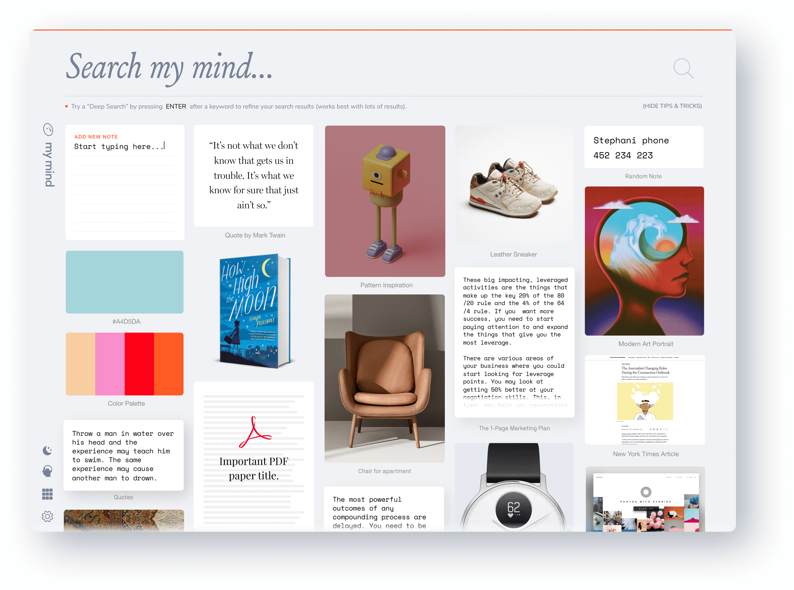
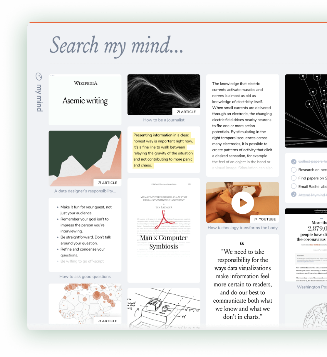
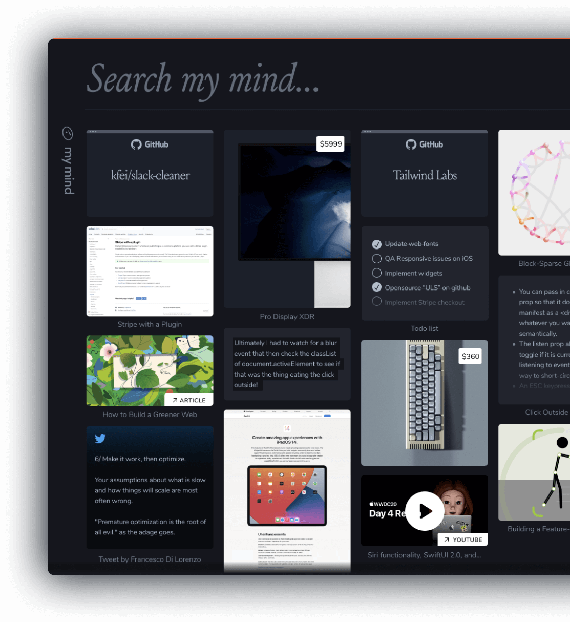
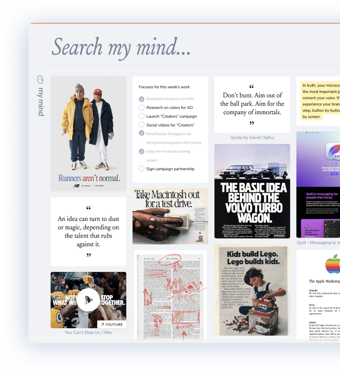
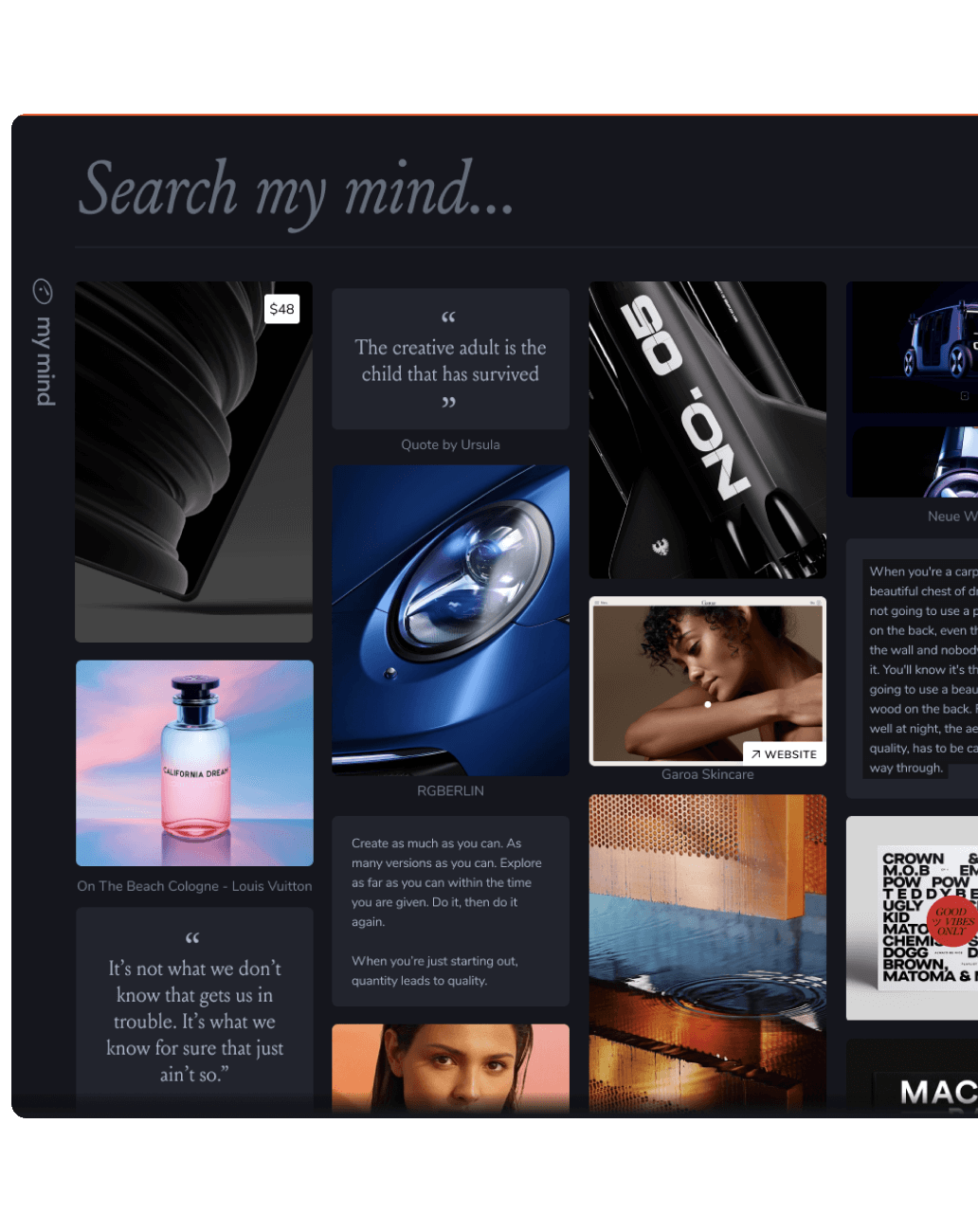
The aesthetics and design of MyMind were what initially caught my attention. I have a soft spot for visually appealing interfaces, and I am willing to pay a premium for a well-designed experience. In addition to its aesthetic appeal, MyMind also prioritizes privacy, which is a refreshing change from many companies that track user activity and sell their data for profit. MyMind's commitment to limiting free usage instead of bombarding users with intrusive ads is another feature that I appreciate.
I find the "Clear my mind" feature in MyMind to be particularly useful. When activated, it randomly presents an item from your library, allowing you to decide whether to keep or delete it. This is an effective way to declutter and remove outdated content, while also resurfacing items that you may have forgotten about.
The search functionality of MyMind is also good, providing both regular and smart searches. Users can search for items based on colour, keyword, phrase, date, or any other criterion. Moreover, MyMind enables users to perform natural language searches such as "last week," which retrieves all items saved during the last week, or "tweets about Russia," which retrieves Twitter links saved that reference Russia.
Overall, I am thoroughly impressed with MyMind. The app's design, philosophy, and functionality all resonate with me. I particularly appreciate the focus on simplicity, aesthetics, and privacy that the team has implemented. Furthermore, I admire the co-founder Tobias van Schneider's approach to building things that are both visually pleasing and effective. MyMind is a shining example of this philosophy, delivering a well-designed and effortless experience that meets my needs.
But where did MyMind fall short?
Perhaps, one of the most significant promises made by MyMind is its auto-tagging feature, which claims to organize the saved items automatically. The company also extensively advertises this feature.
While MyMind's auto-tagging feature is a promising idea, it fell short in its implementation during my time with the app. While it worked well for articles, it struggled with most other types of content, leading me to manually add tags to every item for better organization. Despite the lofty goal of automatically tagging everything using AI and machine learning, it was not reliable enough for my needs. I truly wish this feature had worked better, but unfortunately, it wasn't as useful as I had hoped.
There are several aspects of this service apart from auto-tagging that left me unsatisfied. The homepage layout is designed to resemble a mood board, which is aesthetically pleasing but lacks practicality and customizability. Additionally, there is no indication provided to differentiate between newly added items and those that have already been processed, which makes manual processing a challenging task. Another issue I encountered is that when manual tags are added to an item, MyMind does not display the tags that were automatically generated, making the service less user-friendly.
As I continued to use MyMind, it became increasingly evident that the service was not tailored towards users with information-heavy requirements like me. It seemed to be primarily geared towards designers and the UI/UX community, which is reflected in the service's interface design. For example, while the auto-tagging feature worked exceptionally well in extracting colours from images, it lacked proficiency in other areas.
One of the most significant issues I encountered with MyMind was related to its import functionality. Unfortunately, the service does not offer any options for importing content, and instead recommends starting afresh with their platform. This posed a significant challenge for me, as I already had a well-organized library of content that I was eager to use with MyMind. Unfortunately, moving to MyMind meant that I would have to either give up my existing bookmarks or continue to use two separate apps simultaneously, which was far from ideal. As a result, I found this aspect of the service to be quite frustrating and not well-suited to users who already have an established library of content.
I decided not to switch to MyMind due to the underwhelming performance of its auto-tagging feature and lack of import options. Given the subscription fee, I found that the free version of Raindrop provided better value and more robust functionality compared to MyMind.
To make MyMind more user-friendly and seamless for all types of users, the developers should focus more on enhancing the functionality and practicality of the service, rather than just the design. A more customizable homepage layout and an indicator to differentiate between newly added and processed items would be highly beneficial for users who have to manually process items. Additionally, MyMind should ensure that both automatically generated and manually added tags are displayed for each item. By addressing these issues, MyMind could significantly improve the user experience and better meet the needs of its users.
I have been following MyMind's development for over a year and have noticed significant growth and feature enhancements that improve its overall functionality. Despite my reservations, I am impressed by the progress made by the team behind the app. Moving forward, I hope that they continue to iterate and improve the service's functionality to make it more user-friendly. As a result, I am keen to follow MyMind's roadmap and see where it takes the app. If the developers can address the issues, I am open to switching to MyMind in the future.


